|
|
This is an old revision of the document!
Style Bugs
It's time to start a list of things somewhere so I can keep track of everything left to do in the ongoing style work.
I wouldn't mind help with certain tasks at this point, but I've established my vision for how this is going to go, and I've put the LONG hours into making it happen, so I hold the veto pen, and nothing should get done without it going across my desk first.
Outstanding Issues
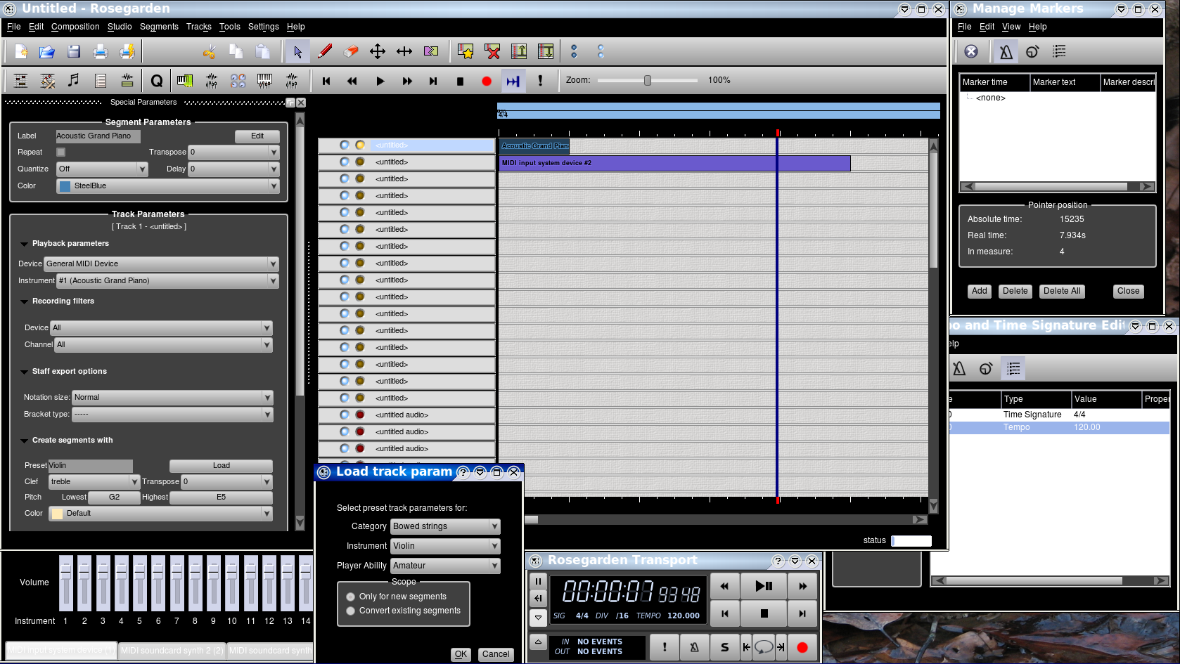
Configuration page layout needs to be rewritten (oh CJF, please, please do that for me as you can see from this list I have quite a lot to keep me tied up for a long time) and this brings home the point that the code I block copied for the tab widget thingie looks like complete ass. It needs the same gradient as the buttons and combo boxes, and probably black text.
Audio mixer quite hopeless. Is that void at the bottom supposed to have text that I just can't read? Principally, the whole #FADER hack hasn't worked since Yves fixed something, and this might need the spot stylesheet hammer or something. Fixing the faders would help, but it probably needs other TLC.
MIDI mixer appears superficially functional except for the faders, but very bland like a dialog suffering from QWidget underspecificity inhertiance glee overload, and probably needs TLC in the style file
Manage Metronome: diabled Apply button has no style. This is a hint. Otherwise looks OK, I think, except for broken notation widget that's out of scope. And spinboxes, but hoping a global spinbox fix will percolate widely, due to low conflict potential (like scrollbars)
The new device manager is really very dreadful in this scheme due to style bugs on the one hand, and due to problems with things that are actually working correctly, like the groupbox backgrounds. This one needs serious attention, but it's probably pointless until it settles down. Improve it some, surely, but don't bother trying to get it perfect yet.
VUMeters aren't working properly, and most particularly their numbers are never showing up. This isn't style related, but fixing it is quite likely exacerbated by the added difficulty of no longer being able to use QPalette for background colors in this tangled web of QWidget hacks. [This is a good one for someone else to look into for ideas why it isn't working at all, and then I'll look into any fix to make sure it's stylesheet-compatible.]
Menu fonts look like total ass on my system. Bold fonts are not bold, but drawn twice in a “ghost” mode that looks like channel 13 when I was a kid. Which Spiderman is the real Spiderman? No other Qt4 apps seem to have this problem, and we don't have this problem, or it isn't nearly so visible, unless the background for the menu bar is black. Could be us, could be Qt. Needs research with an eye toward improving if possible, so I don't wind up taking a ton of crappy looking pixmaps for tutorials.
Settle the menu question. Is this good enough, or still not quite right? We need a somewhat light background or else a lot of lighter pixmaps, plus I just don't enjoy the stark look of an all black menu, but I'm not quite convinced by any of this yet. Settle it before settling combo dropdowns.
Random combo boxes have random dropdowns with random colors, like black and green. I didn't document any of that in the dialogs I ran through and commented on further down. This is something to watch as I go, and document further.
The QToolButton (I think, TPB) little down arrow thing needs a lighter pixmap for better contrast, but probably not white. (Or a black pixmap with a button-colored background and border hard coded into itself might look good, but going with a light arrow is probably the sensible road to follow.)
PushButtons get weird dotted lines around the text sometimes. Not sure if this is style-related, or just because this is the button you can hit enter to push or something beyond our control. I don't like the look, and wish the dotted lines would go somewhere else, but I won't lose a lot of sleep over this one.
The parameter area or track buttons and sometimes other things randomly get a weird blue halo around them. This is some other kind of “this thing is in some kind of selective focus” indicator that's probably coming from Qt, and might have always been there, but now it really shows up against the black. This is irritating, but I can live with it unless someone has any idea how to turn it off (or if someone has the idea that turning it off would be bad, m'kay?)
Tempo/Time editor has white/black on “QHeader” I think it was, instead of taking the right style. This is not what I want, but it's legible, and I won't freak if I have to leave it.
Rulers are being little bitches about taking some effing color other than the default. I've tried seventy dozen kinds of QWidget hacks, and even spot stylesheet hacks. Nothing ever touches these stubborn bitches. Nothing. I may have to let them win this round unless I resort to rewriting them to draw themselves a different way. Also note that the chord name ruler is completely useless as far as I can tell, but I don't know if this is entirely due to the style, or just due to the port. I suggest we just get rid of the chord name ruler if it's that much of a stubborn bitch as the rest. Who needs it anyway? It almost always guesses wrong, hasn't been turned on by default in the longest time, and I forget it's even there. Not seriously proposing we get rid of it, but I might get behind that solution if nothing else works. It's not worth a lot of trouble to save.
The “Edit” button in the SPB inherits a light gray background from its parent. It's the only known dialog at this point that still has a background problem, although there will probably be more. I consider fixing this a low priority, but it's worth noting.
All the QInputDialogs I know about that have a QLineEdit in them are now legible, at least, but the QLineEdit style never works, and they have white text on black backgrounds with grayish (probably #AAAAAA) borders. This could look better, but it's not unusable.
The radio buttons and check boxes are using pixmaps I ripped off from some Qt tutorial, and they look dreadful. Both of these need to be redone completely, and the style code needs to be ironed out as far as hover and checked and unchecked, which weren't behaving in a very sensible way with my first set of pixmaps. [This particular task is open to anyone who feels inspired to work on it, though I will get there myself eventually if no one steps up.]
Transport dialog tooltips need another layer of override protection. They're taking their styles from the newly restyled QWidget or QFrame or whatever it was. If this is difficult to correct, I can live with it, but it would be nice to correct for consistency.
The Tempo editor Filter section needs a spacer (evil) or some more clever bit of hackery to tighten up the spacing of the check boxes, and group them together. This looks bad. Compare to 1.7.3. Not really a style bug per se, and open for the taking.
The damn combo boxes still don't have a working hover. If I can't solve this, I don't actually care if I just undo all the hover everywhere, but it needs to be consistent no matter what we do. (I don't quite like the current hover color scheme either.)
The track buttons selector colors (hard coded with spot stylesheets out of necessity) just don't look right, and I'm starting to question the whole idea of making this selection look like a normal selection anyway, since it isn't a real selection, and we're no longer making any use of the old foreground/backgroundRole() palette stuff for these (out of necessity.) This gives users the sense that they can select more than one track at a time, and they never have been able to do so, although I quite like the idea of being able to do that eventually. (Low priority wishlist.) As such, I'm thinking it might be a fine idea to make these go darker or lighter or raised or sunken or something as opposed to looking “selected” in the conventional way. Something to harmonize with the rest of the scheme, of course. Probably in grays.
Matrix group boxes don't have the same scheme as RosegardenParameterArea and most (one might hope all, but probably not) of the dialogs. It's all QWidget overspray black everywhere, even trying to style #Matrix. This will probably be ugly. I would consider doing a stylesheet for each of the major edit views if that's an easier way to drill down to their level.
I like the toolbar handle I've got better than anything else I came up with, but it's only suitable for horizontal toolbars. I can't discover any way to specify an alternate handle for vertical toolbars in the stylesheet. If this exists, it isn't documented anywhere, or it's deeply buried in googlespace. This problem will need to be solved, or else the handles have to go in favor of something more ugly and more workable. I have some kind of :top :bottom / :left :right thing in there to flip the gradients. It's not documented, but is there some way I can add :top::separator or some other combo to solve this? If not, can I solve it with spot stylesheets in the code that creates the toolbars, specifying an alternate pixmap for the grabber?
Progress dialogs are coming out solid black. Progress dialogs are still broken to the point where they're random and useless, so I haven't bothered to try to iron this out at all. I haven't tried to style the actual progress bars themselves yet either, but that needs to be done eventually.
Segments → Set Start Time has a green background (where is that coming from? I forget. It's a “this is what this does” flag color.) Its initial size is too small, and it has to be resized to be usable. Looks OK otherwise though, assuming the spinbox fixes are made, and I don't get into too much trouble with the background/foreground nonsense again.
Fixed Issues
Regression Prevention Snapshots
Committed revision 9957.
|
|
